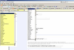
Call me Americacentric, but I can't stand it when I go to a reg form like this one and I have to scroll ALL THE WAY DOWN to get to US or English.
For most sites I visit, the primary visitors are from the US or one of 7 other countries (I did see one site where the G-7 or so were listed first).
It just makes more sense to make it as easy for most customers/visitors to move on.
I think the folks in Azerbaijan won't mind too much.
Thursday, January 11, 2007
blog comments powered by Disqus
