Image by wallyg via Flickr
In his best-selling book, “A Whole New Mind,” Dan Pink (client) explains how the next age of economic development, the conceptual age, is going to require a new set of skills.
Traditional “left-brain” skills (logical, analytical) are necessary, but not sufficient. A lot of the times, they can be automated or outsourced.
“Right brain” skills that convey design and emotion are where true value will be created.
If you’re not naturally “right brained,” Dan advocates a disciplined and focused effort to train that muscle.
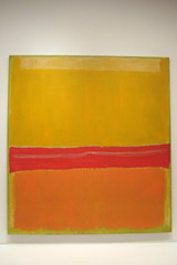
And that’s where Mark Rothko comes in.
The other day, I attended a seminar at the Smithsonian called “Mark Rothko and his Philosophy of Color,” with the goal of working my right brain.
It did.
But, as usual, there are a few marketing lessons hidden within.
The lecturer, Klaus Ottman, did a great job of taking what could be dismissed as “simple blocks of color” and helping us all think about the ROLE of color in our daily lives.
For Rothko, color represented “basic human emotions.”
For each color, there was/is, in his mind, a universal human reaction to that color. In other words, we all FEEL the same way when we seed the color RED.
BLUE, on the other hand, represents to us traits such as “wisdom, moral philosophy, truth, and principles.”
So, how DOES this connect to marketing?
We are all aware of how we use color in our corporate logos, for example. The Never Stop Marketing logo is red and black, in part, because I had the FEELING that those colors would convey the intensity of the emotion that goes with the name, that is wrapped up in the idea of the “shot of marketing espresso.”
![NeverStopMarketing[400]](https://blogger.googleusercontent.com/img/b/R29vZ2xl/AVvXsEjDnu774SGHHTQmuencmJJVuzHZUFWnFPNb940gH0oBM57dkdJMd2q807r4_h2Xg2fNlwnLEmYrUUoeVp9VI1SSD0yvfykxnwNRkNx7hy79AGpvXY9HsgM9f3-ERW1W6UOqbp7LHA/s1600-h/NeverStopMarketing4002.png "NeverStopMarketing[400]")
But, color plays a HUGE role in many other facets of our life and they have subtle impact on our audience and our community. Sure, the clothes we wear, but also,
- what the does room look like where your event is being held? Is it a boring hotel room or a venue that has the vibrancy you want?
- What about the walls of your offices?
- How about your booth at the tradeshow?
All of these are “touch points” that are part (or not) of the marketing experience we are looking to create for our audience…giving them further reasons why they would tell themselves, “this is the company I want to work with…it just FEELS right.”
What’s more, as we move into a world where we need to make everyone a marketer and follow the principles of Maya Angelou marketing (people remember how you made them feel), what if you said, “we want people to feel X, kind of like the color Y?”
If Rothko is right and we all have a universally similar response to color, then communicating in COLOR terminology (and visuals) to your team and community may be a competitive advantage.

 Subscribe to RSS Feed